


This article aims at analysing some of the modern web application problems and how we can solve them by using interface animations.
Why are we seeing interest in interface animation? It's because animation supports the essence of real interactions, it creates the same emotional benefits like when people interact with physical objects in real life.
Let's review some of the common problems and how interface animation can help solve them:
1. I want to know the status of my action
I want to know the action is done
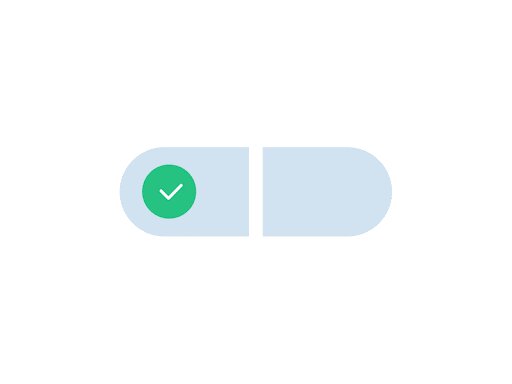
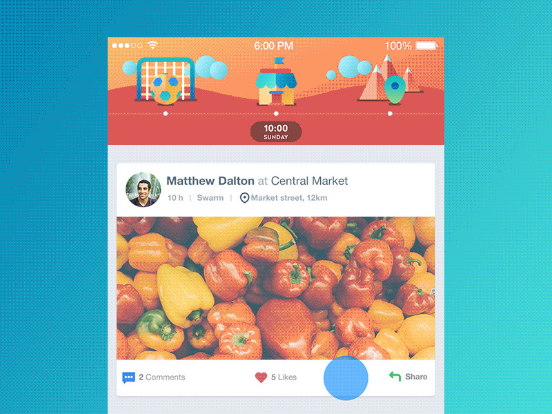
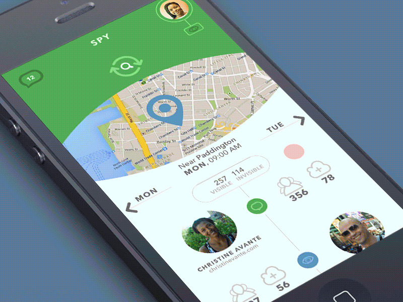
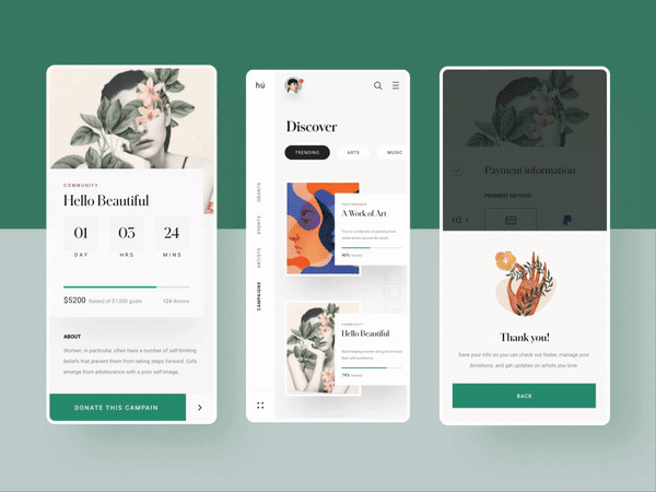
This problem can easily be solved by using microanimations. Microanimations give fast feedback and can make the user experience positive. Animated buttons, switches, toggles and other interactive elements inform the user of the result of their action.
I want to know the action is in progress
When users interact with a digital product, they want to know what is going on at every single step. Making users wait in uncertainty is the risk of losing those users. When users are informed, waiting can become a more enjoyable experience. This aspect should be taken into account and there are many ways to support it via interface animation.
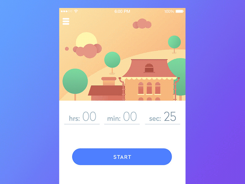
I want to know how long it will take
Most of the time letting the users know that the process is going on, is not enough. Showing the user how fast it is progressing and how long it will take is something that interface animation can help with. Loading bars, progress bars, animated timelines, and other dynamic elements can help:
- – inform user about the level of progress
- – become the entertaining element, removing the negative experience of waiting
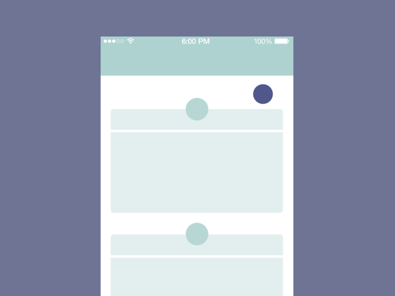
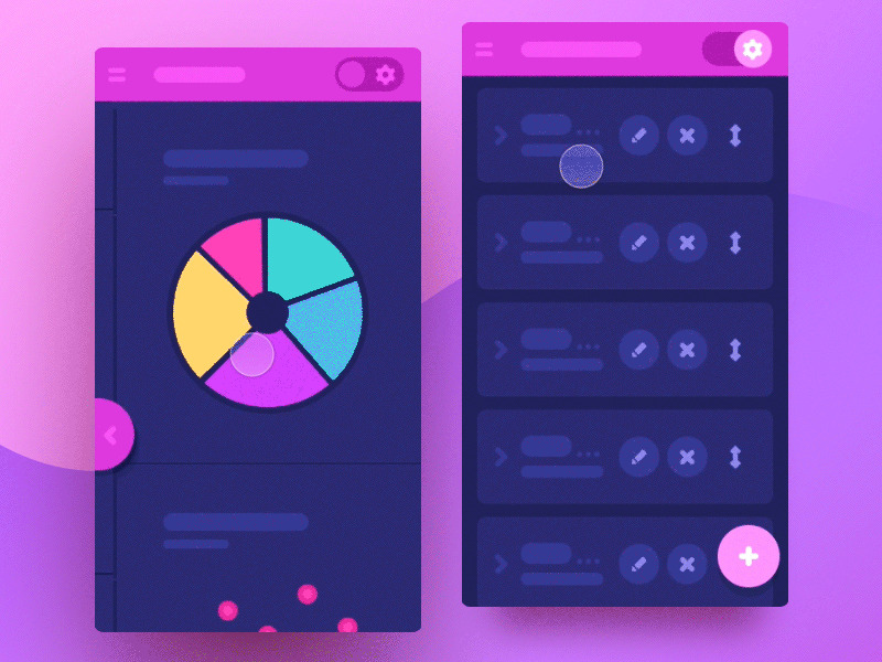
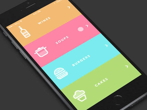
2. The screen is overloaded
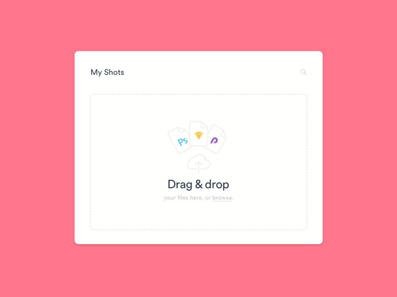
If the screen or page looks like a mess, overloaded with tons of data and options which is not clearly organised, it will require additional effort from the user to understand how it works and where the needed information can be found. The more effort, the higher chances the users will go away in search of a simpler solution.
Off-screen patterns have become more common as devices and screens have gotten smaller. On the web, this is very often used for off-screen navigation patterns or similar patterns that keep a section of content waiting just outside the viewable screen area for when it’s needed. This approach is best for content that is global in scope and important enough to be needed by the user at any time, which is why it’s used so often for navigation.
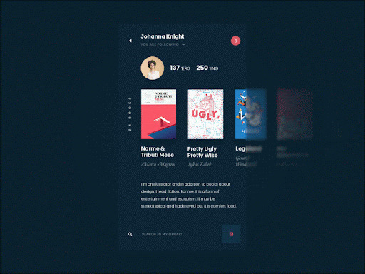
3. User is disoriented
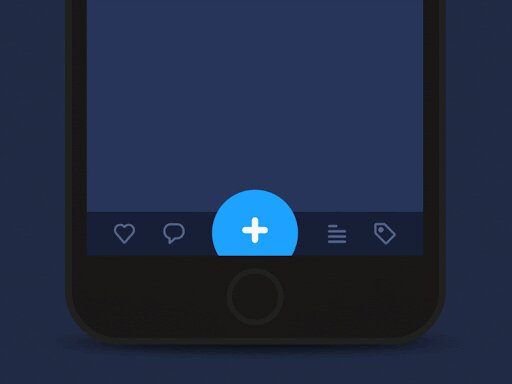
Visual hierarchy and clear navigation is also an important aspect. Users attention should be immediately drawn to the important element of interaction according to its goal and conditions. Animated interface elements help a great deal with this, enabling faster and more distinct visual marking of important elements in the layout.
Context change is confusing the user
Any time the view of the content on-screen changes (switching to a detailed view, zooming in, reordering a list, etc.) the context of that content has shifted. The context might be shifted to give a more detailed view, or a less detailed view, of the same information. Or it might be changed to reveal new information about that content. Shifting the context can make it easier for users to understand the content they're looking at; however, the way that context change occurs has the potential to be disorienting.
Using animation to visually smooth out and inform context changes can reduce the chances of disorienting users by making the context change play out in plain view. Using animation to show where elements have moved to, which elements have newly appeared, and which elements were there all along, make shifts in context easier to follow. When the change can be followed visually, there's less chance of users losing their place and less chance for them to be unsure if what they’re looking at is indeed still the same content.
4. Interaction does not seem natural
This is a problem that most users will not be able to explain, but still it has a great influence on user experience. Animation in the interface can create a pleasant illusion close to natural interaction with physical objects which often doesn’t need too much cognitive process. For example, if you pull the object, press it, move out the tab, the movements should feel natural.
Thought-out movement of layout elements while the webpage is scrolled, animation can enhance user experience significantly and create the feeling of one integral smooth interaction rather than several separate parts or blocks of the page. All in all, it's pleasant and engaging, and these emotions are a good factor of retaining users.
Eases are a strong piece of an animation’s branding. If you work for a company like a bank or a financial institution, your eases are more likely to be Sine or Circ but if you work for a more playful company, a Bounce or Elastic ease would be more suitable.
Motion design languages are important for getting everyone on the same page about what types of animations you're going to be creating. For this very reason, you can keep your code DRY by reusing eases in variables and interactions in functions, and keep consistent behaviour across your site and even across multiple platforms.
0 Comments
Leave a Reply
Your email address will not be published. Required fields are marked *