In the previous article we went over some of the most common user interface problems and how animation can solve them. There are other problems worth mentioning and we will analyze them in this article.
5. The application is boring
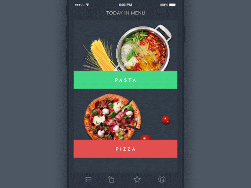
People often focus on the functional side and that's logical but still it cannot null the fact that people are driven not only by logic. There are also other big factors such as emotional and aesthetic satisfaction that are able to influence user experience. Animation can mark out the beauty of colors, breath life into layout, make movements smooth and strengthen the power of UI elements.
6. User is lost, requires guidance
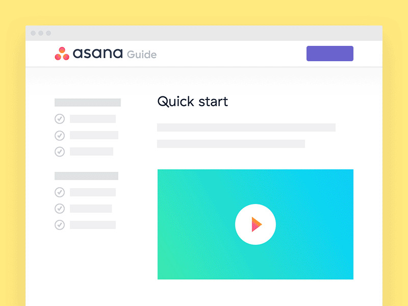
Animation can be extremely helpful for guiding users through task flows. Using animation to keep users on task, and to provide a hint to what comes next, can help users complete the task more easily.
7. I want the user to focus on what's important
Animation is incredibly useful for attracting attention. In fact, that's a big part of why it's used so much in ads. Imagine yourself scrolling through an article on a website and halfway through the article, you find yourself looking at an ad with an animation.
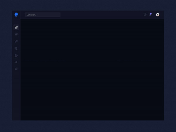
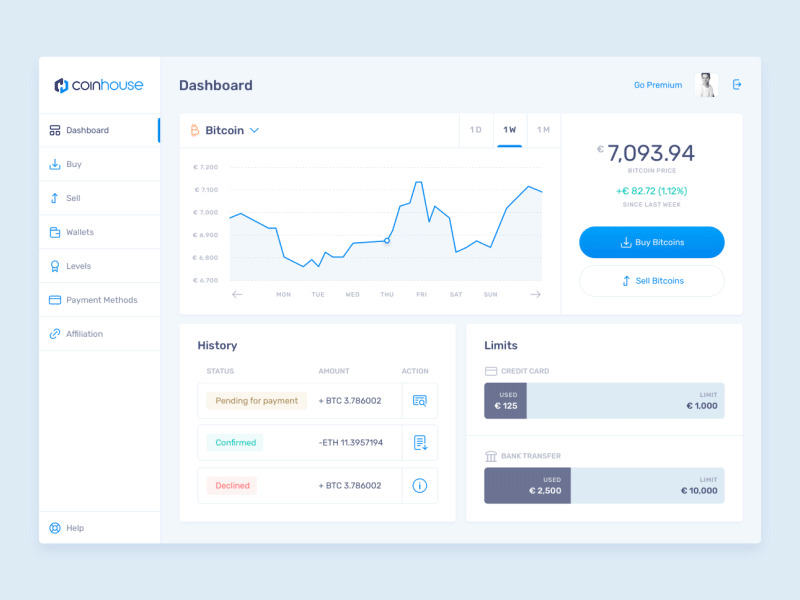
A Fitness App dashboard can use animation for displaying user data like total steps taken, calories burned, and sleep tracking. See it in action in the example below:
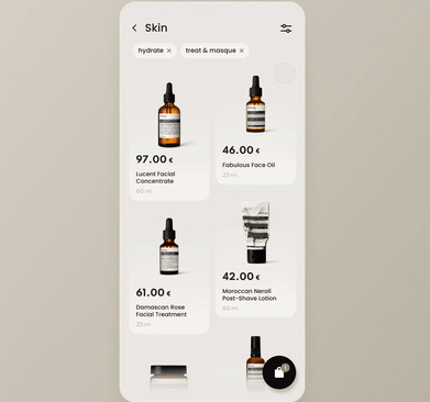
Visual continuity can be established by having the product persist on-screen while other elements come and go. It also helps provide feedback by animating the product in cart when it has been added to cart.
8. I want to know the potential of an action
One of those complex interactions includes reordering content, which comes up a lot in apps or sites that include list or file managing actions. These aren't the only cases where animation can be useful to preview the results of an action, but they are the most popular, so you'll notice a few of a them running through the next examples.
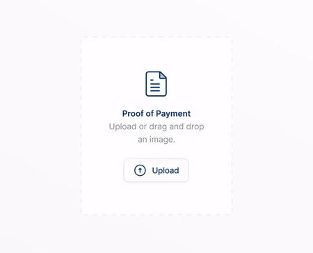
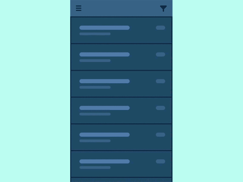
Animation can be used to show the immediate effect of an action, which also serves to confirm the results of that action. By confirming the change visually, often by moving objects out of view or into a different position, your interface plainly shows the user what has happened.
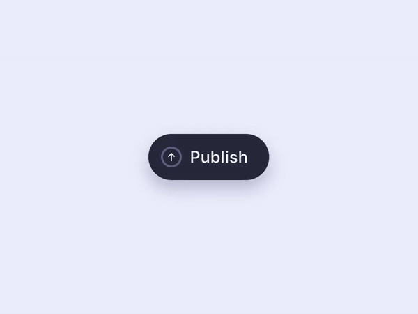
In this example the user can hold to confirm his actions before they become public in a button text animation sequence:
9. App doesn't tell a story
Websites can use animation, concept, and imagery to get their core values across and tell a story that will hopefully appeal to their core audience.
More information can be conveyed with animations for any of the written content on the page. The fade-ins of the content's entrances create a dreamlike feel, especially when combined with the soft focus of the background images. The animation can be used to express an emotional connection with the viewers along with the rest of the design choices.
Lusion is using animation throughout the website to enhance the user experience and tell their story, they create digital interactive experiences.
Dogstudio uses a type of mascot that follows you while you scroll the page which enforces its brand.
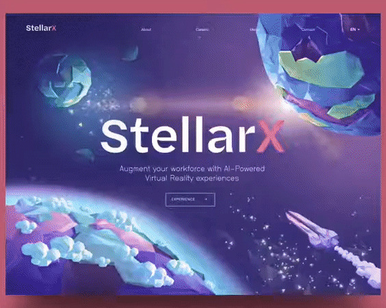
StelarX product offers AI-powered VR experiences with the primary use case being worker training. In this StellarX example 3d animations are used while scrolling down the page, in order to boost the concept of what the product can do for you:
I believe that animation has a massive potential of enhancing the general user experience. Given the example in this article you should start brainstorming ideas to enhance your application UI by using UI animations.






0 Comments
Leave a Reply
Your email address will not be published. Required fields are marked *